- User Testing
- Sketches
- Wireframes
- Prototypes
- Final Visual Design
Team Members
- Tela Cheang
UX DESIGNER / VISUAL DESIGNER
- Brian Plumacher
BANKRATE SENIOR PROJECT MANAGER
Duration
- 1 Month
Problem:
Even though Bankrate’s SEO is great and they’re always on top of Google search results and attaining healthy traffic, people were not clicking through to the rate table which is where their revenue is based on each click. They were losing to competitors’ with the same product.


Results:
The idea of bringing up the available rates into the actual calculator has lead to a 33% increase in RPV (revenue per visit) on desktop, and 75% RPV on mobile.

RESEARCH AND DISCOVERY
See more pre-design work from the research and discovery phase that informed design decisions for the Auto Loan Calculator
Bankrate Casestudy
User Testing
We conducted a baseline user test with current Bankrate users and also used an exit survey to gather information about why people were using the Auto Loan Calculator.
Key Findings:
- People preferred to finance through their own bank/credit union rather than with dealerships
- Majority of people looking to buy a new or used vehicle, less than 20% were looking to refinance an existing car loan
- Mobile was important because people were checking rates while they were at dealerships


Low Fidelity Concept Prototype
Low fidelity wireframes in blue. We tested this prototype with users through InVision to see if different ways of inputting interest rates would be more engaging. Though we didn’t want to distract the users with visuals, some were thrown off by the lack of fidelity because it didn’t look functional.
UI Input Exploration

Mobile Prototype

Key Findings:
- People didn’t really know which credit rating they belonged in
- They were confused that the rates on the calculator didn’t match the rates on the rate table (offers from lenders)
- The rate table was often overlooked because people didn’t scroll down
With these findings, we started to brainstorm ideas and ways to combine the calculator with the rate table for more conversions.
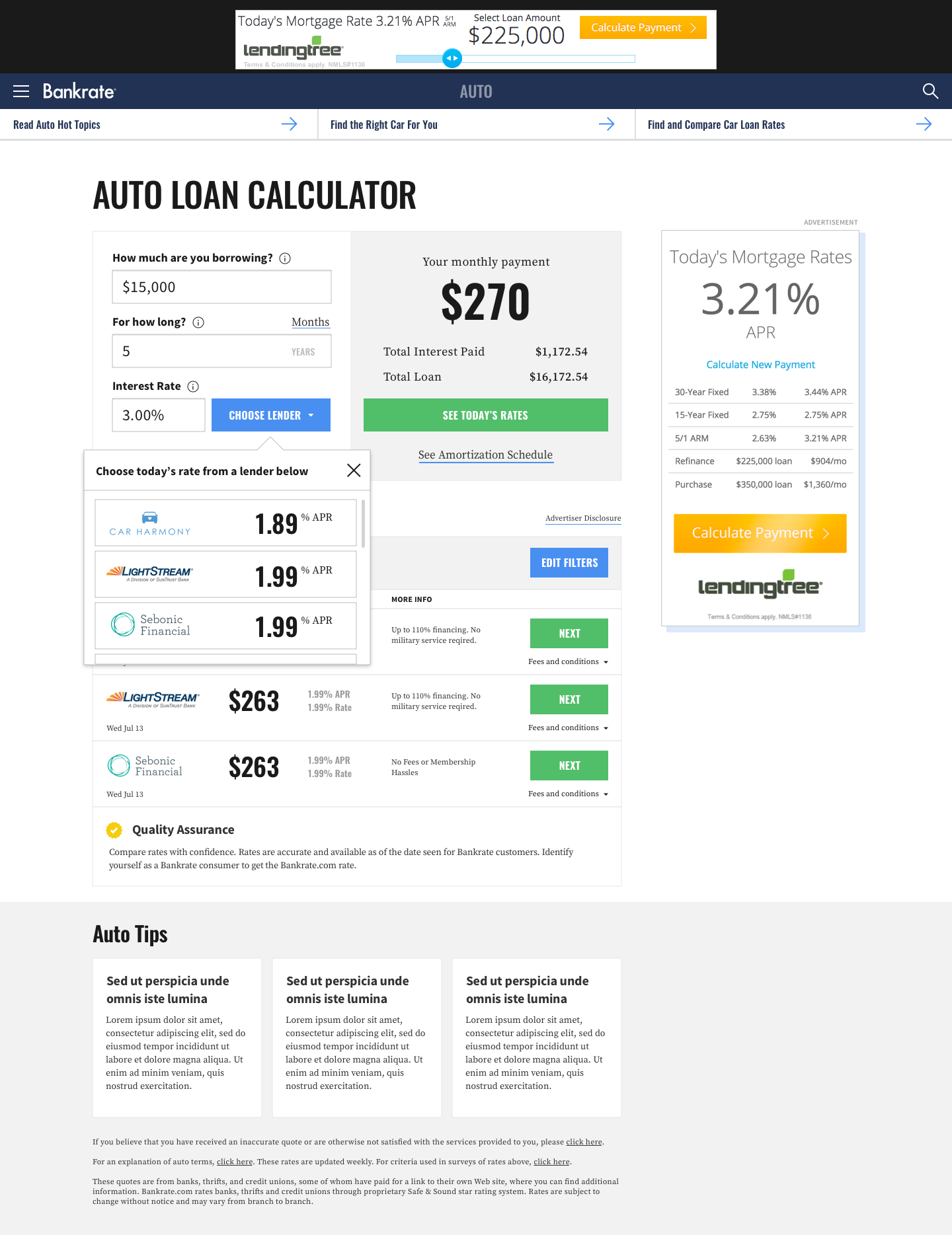
It was clear that the calculator and the rate table feels very disjointed and separate. I came up with 2 options for both desktop and mobile to better incorporate the rate table into the calculator. At this point in the process, I was asked to put the wireframes into an “Interim” Visual Design as the new Bankrate style guide was being finalized.
On the original calculator, the “today’s rate” button takes the user out from the calculator experience to their Auto Rate Table page. This would make users feel very confused because they often had no idea it wasn’t part of the calculator.
Option 1 – Plug in rate
In this option, I used a drawer to bring in actual rates of the day into the calculator as users calculate their monthly payments.

Option 2 – Better Table Focus
In this option, I brought the rate table above the fold right next to the calculator. In the mobile version, I made the results of the calculator sticky to the top and continuously validate/update so that the rate table would be right under the fields, not hidden by buttons and other things.
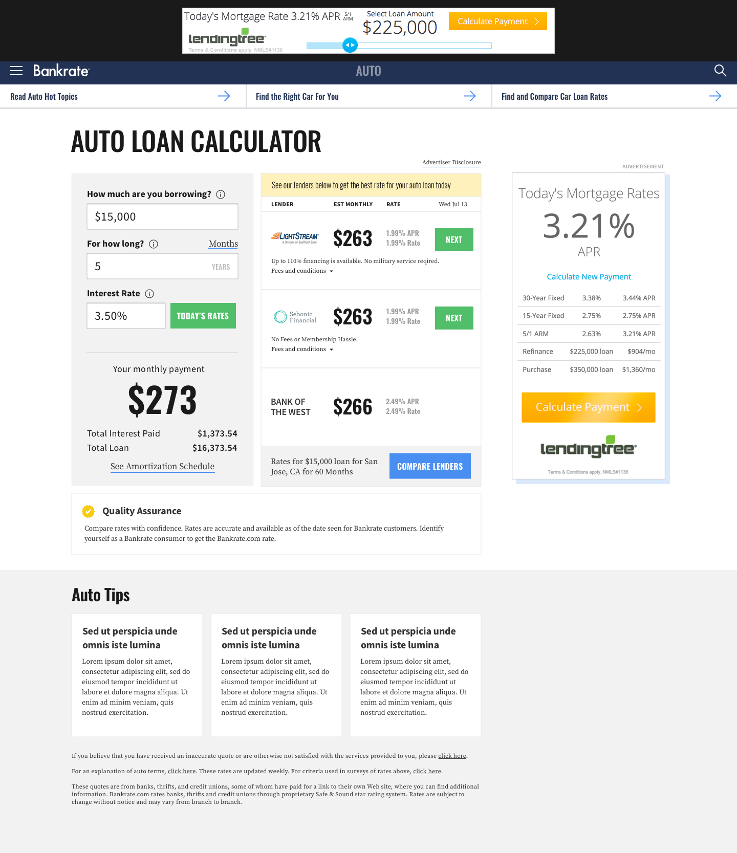

Final Visual Design
Option one was chosen and developed and is now live at the Bankrate website.

