A lot of people don’t find what they are looking for or are confused. We are not engaging them with the right experience at the right time.”


-SVP of Product and Data Science

Deliverables
  • Stakeholder meetings
  • Ad-Hoc Personas
  • Persona Workshop and
  • Formalized Personas
  • Sitemap
  • Storyboards
  • Revenue Models
  • Journey Maps
  • Scenarios
  • Sketches
  • Wireframes
  • Prototypes
  • Final Visual Design
  • Visual Design Style Guide
Team Members
  • Jason Frasier
    DESIGN DIRECTOR
  • Maureen Hanratty
    DESIGN LEAD
  • Tela Cheang
    UX DESIGNER
  • Sarah Lutz
    VISUAL DESIGNER
  • Zainab Rupawalla
    VISUAL DESIGNER
  • Scott Cronin
    RESEARCHER

TOGETHER WE…

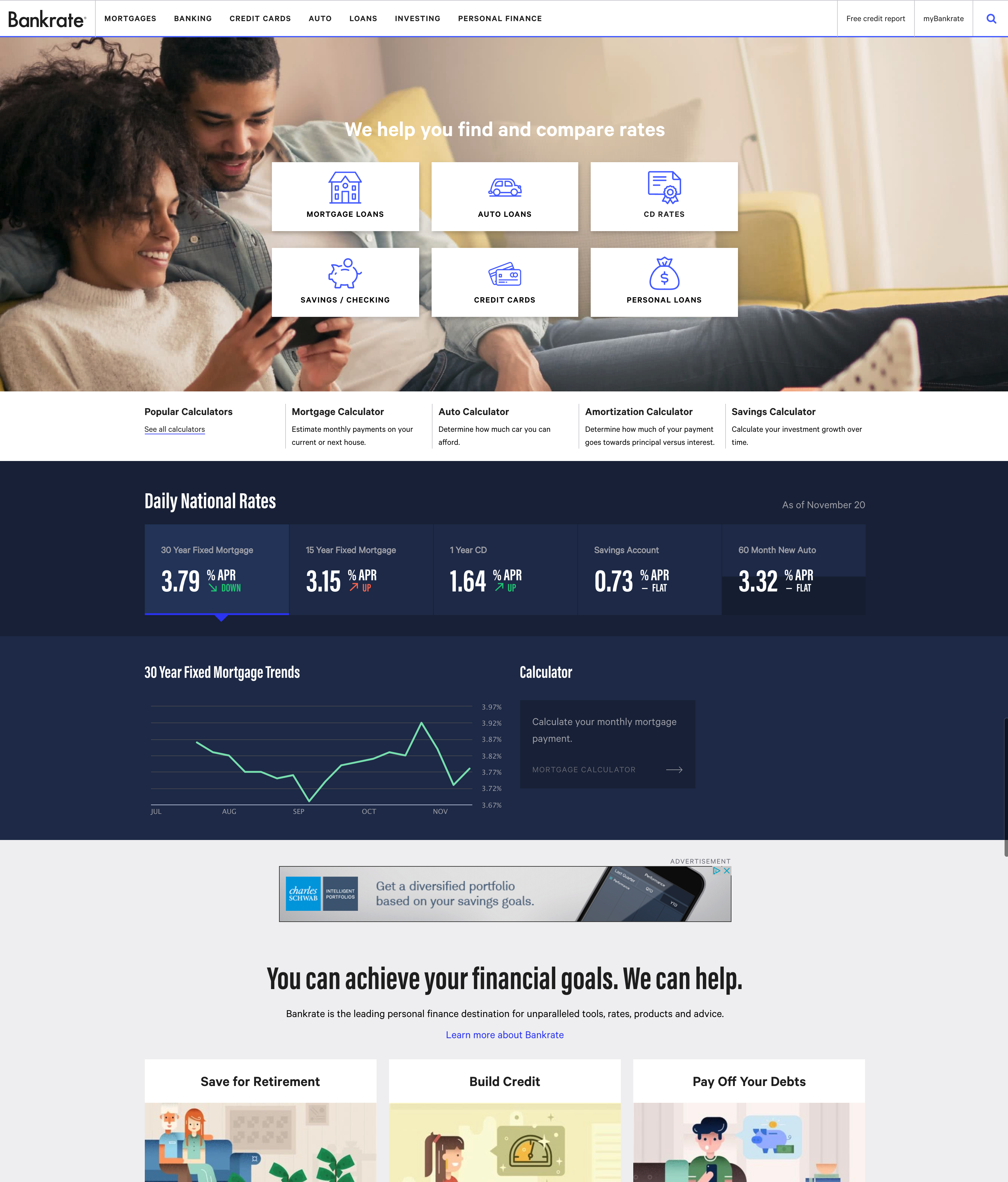
Completed and launched a visual redesign of their entire site, including implementing a new design system.

Redesigned the auto loan calculator, which lead to a 33% increase in RPV (revenue per visit) on desktop, and 75% RPV on mobile.

Introduced a new template for articles, which doubled the number of impressions (ads displayed) per session.

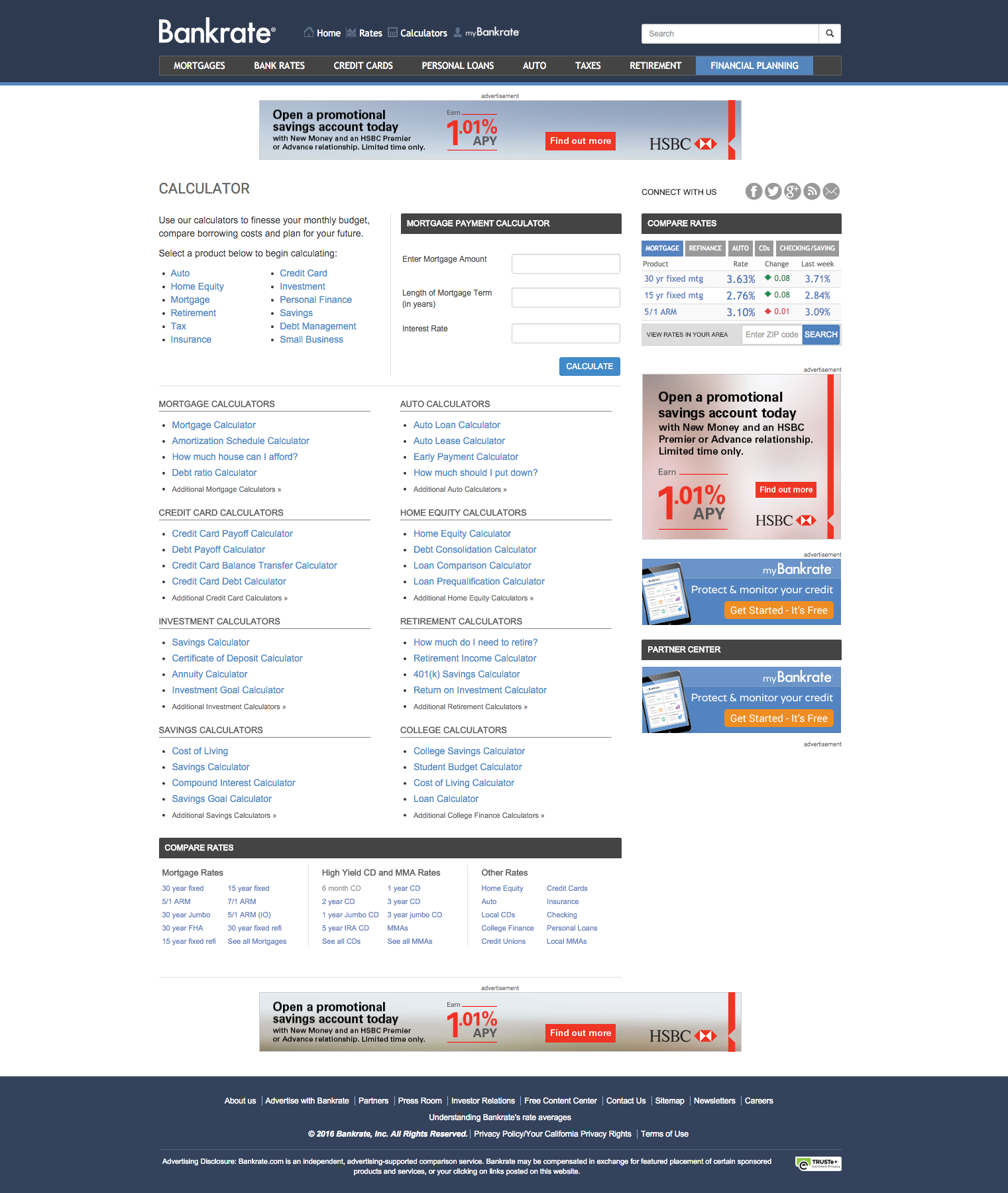
Though functional, the existing site was in danger of falling behind new companies entering into business areas long owned by Bankrate. Newer companies with better and thoughtful experiences were taking away audiences, especially younger people looking for financial products and advice.

Outdated navigation that has no organization to how things get added, inconsistent across different parts of the site
No thoughtful placements for ads
Tools and pages all styled the same as text links
Ads take visual focus away
Old and outdated look and feel

RESEARCH AND DISCOVERY

Stakeholder Meetings

Before and after we kicked-off the project, we started scheduling and interviewing key stakeholders within Bankrate to understand their current state and what their goals and expectations are for this project.

Site has to be light on its feet and easy to consume across devices.

LOU FERRARAChief Content Officer

We walk a fine line between consumer satisfaction and advertisers.

SIMON MOSK-AOYAMAChief Operating Officer

Become a user centered experience as opposed to a purely revenue based experience.

DEEPINDER GULATI SVP, Product and Data Science

Ad-hoc Personas

These initial personas were created by interviewing stakeholders and leaders and light market research. They served to act like a hypothesis on who their primary users are. We began creating these at our kick-off meeting with the client which helped us break the ice and work together as a team.

Financial Journey Maps

We used the personas to create journey maps that would highlight life events that could happen and makes Bankrate’s products useful to them.

Comparative Analysis

We want to conduct a high level comparative analysis of different websites and apps to examine ways of presenting content while keeping users engaged. The following are themes that we examined:

  • MEDIA AND TYPE – Emerging themes for content-heavy web sites

  • ADS + READING EXPERIENCE – Trends in combining ads in with the user’s reading experience.

  • NATIVE ADS – Matching form and function of the platform.

Formal Personas

We conducted 20 interviews with current users and held a 2-day workshop with the Bankrate team to generate the personas.

Many other tools and methods were used during the discovery phase to generate ideas and understand the space that Bankrate occupies. With this new understanding and information, we brought the ideas into the design phase.

DESIGNS

Article Story Concept Sketches


Ways to engage the user

  • Checklist for task
  • TLDR (summaries before article)
  • Saving progress

Ad Layout Wireframe Exploration

With learnings from the comparative analysis, we quickly explored in low fidelity different layouts to serve ads without distracting reading experience.

Component Breakdowns and Wireframes

Design Direction Exploration

At this time, Bankrate was still trying to develop their new brand and voice, we came up with a few different directions for the Article Story

Focused Path

  • Streamlined
  • Journey-based
  • Emphasized Author Voice

Financial Tech

  • Friendly
  • Social and collaborative
  • Bright and basic

Digital Magazine

  • Authortative Voice
  • Strong Point of View
  • Bold and Modern

Keynote Animation Prototype

Final Visual Design

The final visual design for the Article Story was delivered to the engineers through Sketch’s Zeplin App

Social sharing that follows you as you scroll down the page
Breadcrumbs to improve navigation to topics.
Right rail ad follows as you scroll, replacing ads and also recommending further reading.
Listicle format, proven to perform better than slideshows.
Placement and style of mortgage table to breaks up the article in a more natural rhythm.
More natural in-line ad to direct people towards the rate table.
Recommended reading to keep people engaged within the website.
Comments for a sense of community, but default collapsed to not clutter up the page.
More natural language for suggestions and integration of sponsored content for less “advertisement” feel

After re-designing the article story, we split up into several different tracks, while I personally was not part of the home page re-design, many of the principles from the Discovery Phase was used to inform and drive the designs.

Related Case Studies

Auto Loan Calculator (Deep Dive)

I was the designer in charge of the redesign of the calculator. It led to a 33% increase in RPV (revenue per visit) on desktop, and 75% RPV on mobile.

Blogs and Blog Index

Bankrate’s blogs lacked personality and voice. as they publish the most current financial news and content that gets a lot of traffic. The old blogs I came up with a scrolling header interaction concept that tracks reading while giving it a unique look and feel.